Dangerbird Records: Slothrust

ART • DIRECTION
design concept + digital interactive experience (IE) for Slothrust @ Dangerbird Records (Los Angeles) to be applied to various touchpoints, including web and mobile
Background
Slothrust is an American alternative rock band signed to LA-based independent record label Dangerbird Records. This IxD project was executed in association with Wayward Creative, an award-winning creative studio specializing in immersive digital experiences for the music industry’s top companies and artists (Sony Music, Universal Music Group, Roc Nation, John Mayer, Jorja Smith, Skepta), as well as emerging talent and indie record labels.
Overview
The idea behind this project is to bring music and art together in the form of an astrology-themed playlist generator to create an interactive experience (IE) for the fans, while also crafting custom digital activations to fit seamlessly into the artist's release campaign and marketing strategy. We've partnered with top streaming services to bring music directly into this experience so fans can listen to new music, follow the band, and save a playlist directly on the platform of their choice. While fans interact and share, artists boost on-platform engagement and streams that result in long-tail benefits far beyond the initial release.
Ideation + Process

Exploration of visual concept and cross-referencing imagery based on existing visual DNA and promo materials supporting the release of Parallel Timeline. Key references include Ellsworth Kelly (color palette) and Eyvind Earle (feel & aesthetics).
The central LP cover image is a rainbow with inverted colors, depicting an idea of playing with visual mind tricks: when the inverted rainbow is stared at for 30 seconds, an optical illusion occurs where the brain inverts the colors to be a traditionally colored rainbow when you look at a blank space afterwards. As color theory and science are relevant in the design and creative execution of the record, the general concept was to interweave multiple cross-referencing elements such as:
surreal-sky spaces
inverted rainbow + associated color combinations
Dreamcore aesthetics
mirrors & reflections
multitudes of selves
One of the key visuals from the band’s single Cranium is an image of moth representing the idea of a parallel timeline butterfly, as opposed to the prosaic pairing of butterflies and rainbows. In spite of the conventional portrayal of a butterfly as a symbol of drastic transformation, moths go through the same process, yet it isn’t celebrated the same way. The iconography of this record explores the space where science and the whimsical intersect and where the unfamiliar becomes hardly recognizable, all the while unveiling a greater reality beyond what the human eye can see. When working on the album art, the band was inspired by the feeling of looking for an obvious answer, only to realize it was just slightly to the left of where you thought it was. In addition to that, lead singer Leah Wellbaum referred to Eyvind Earle and his early Disney castles, the poison apple in Snow White that consequently informed the look of the balloon, and other references that tie together with a loose narrative of things that aren’t quite what they seem, perhaps something you would find in a really strange castle.

Parallel Timeline LP center labels designed for manufacturing process and based on original album art by Ishaq Fahim. Published by Atlas & Pumpkin Graveyard (BMI).
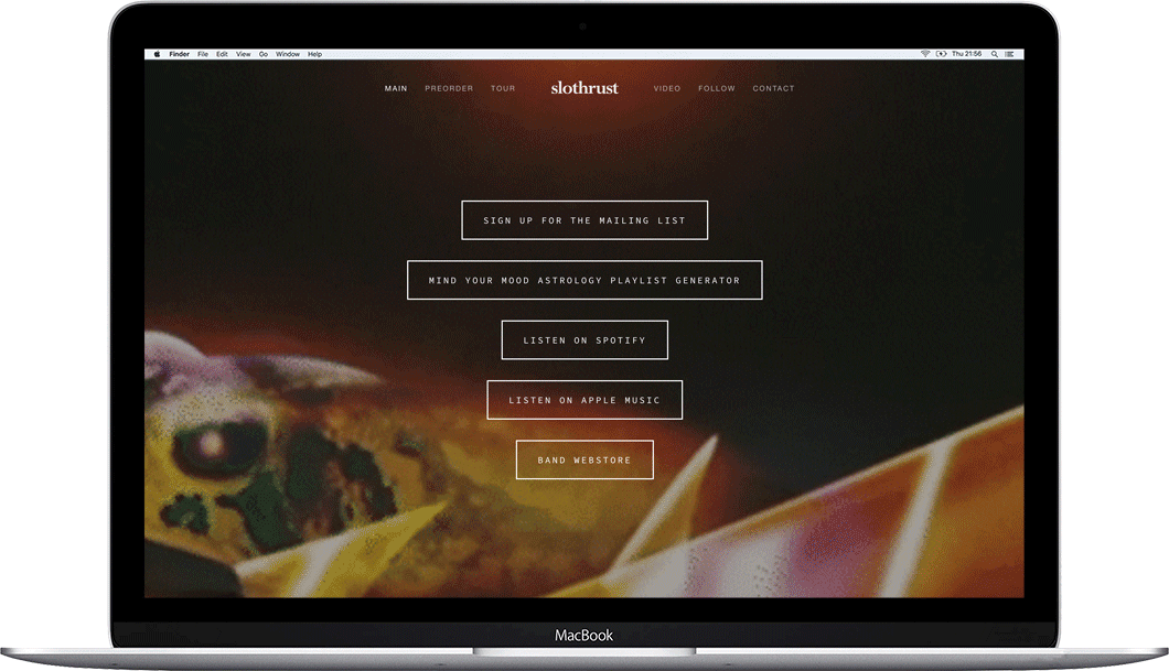
IE Brief & Flow
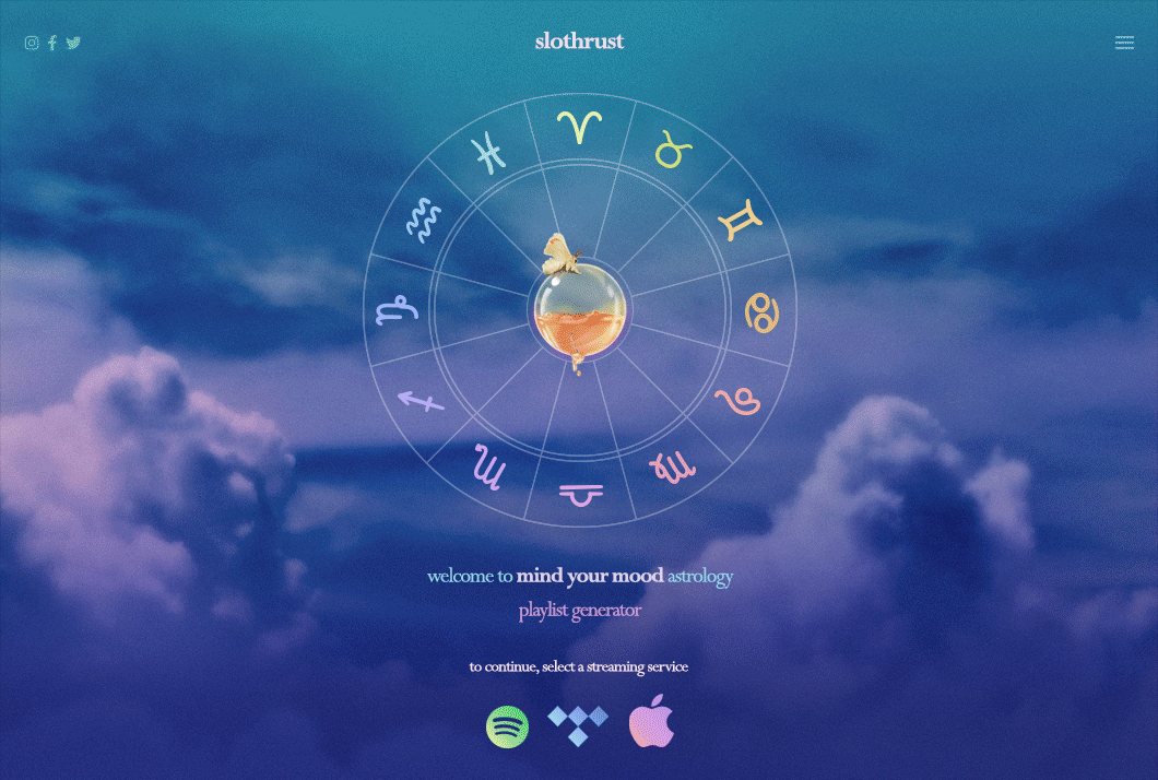
Welcome screen. User story: action (choose streaming platform) + goal (enjoy background music);
Project title / artwork
Brief copy explaining project
UI to select audio streaming service (Spotify, Tidal, Apple Music)
Birthday screen. User story: action (enter birth date) + goal (take a personality quiz)
Project title / artwork
UI to enter DOB
Quiz screen. User story: action (take a personality quiz) + goal (generate results);
Project title / artwork
UI to proceed through a set of multiple choice questions
Final screen. User stories: action (share via Facebook, Twitter, and Instagram) + goal (post results on social media), action (save a playlist on Spotify and Apple Music) + goal (add a playlist to library);
Project title / artwork
Results: zodiac sign + text about personality traits
CTAs (share via socials, save playlist)
Secondary navigation: social media links (Instagram, Facebook, Twitter, Spotify, Apple Music), album pre-order (from Dangerbird website).

User flow chart demonstrating key relationships between the screens (flow steps, processes, inputs/outputs, actions), as well as overall logic and functionality of IE.
Although the architecture and user journey of this IE is relatively undemanding, I still prefer to visualize user flows as it helps to promote user-centered design, as well as to prevent costly and time-consuming errors.
Mockups + Demo
Once user flow and overall logic of IE were approved and finalized, I moved onto design phase and focused on translating predefined visual references into hi-fi mockups, while also aiming at creating a seamless transition between the official website and Mind Your Mood playlist generator.
Progressive transition between the band’s official website and Mind Your Mood astrology playlist generator IE, leading to welcome screen and its native components.
Click-through prototype with functional and interactive elements demonstrating transitions between the key screens of Mind Your Mood astrology playlist generator IE.
To ensure applicable voice & tone, a set of unique questions and corresponding descriptions was created in close collaboration with the band. Focusing on how we want fans to feel and finding the right language by analyzing their behaviors, interests, and culture is crucial when it comes to connecting with the audience. According to The Nielsen Norman Group and its four primary tone-of-voice dimensions, we prioritized Funny + Casual + Neutral (Respectful vs Irreverent) + Enthusiastic. Even though tones could fall at either extreme of each dimension, or somewhere in between, each website’s tone of voice could be expressed as a point in the 4-dimensional space described by these dimensions.
Takeaways
After strategically releasing Mind Your Mood playlist generator just a couple of months prior to the official release date of Parallel Timeline, the band received positive feedback on social media, proving once again the importance of using the appropriate voice & tone. There will always be subtle differences in individual interpretations of tone as it’s a complicated and nuanced aspect of any digital copy. However, the impact of tone on brand perception is invaluable, especially when it comes to creating interactive experiences supported by a digital content strategy.